
Informing your new path of Web3,
Cryptonite
Role:
End-to-end UX designer
Tools Used:
Figma
Otter.ai
Tayasui Sketches
Timeline:
10 weeks

Method:
Double Diamond The Double Diamond Method is a four-phase design process that guides teams from finding the right problem to creating the right solution. It starts with Discover, where research and user insights help explore the problem, followed by Define, where the team narrows down and clearly states the problem. The second diamond begins with Develop, where different solutions are brainstormed and prototyped, and ends with Deliver, where the best idea is tested, refined, and launched. The process uses both broad exploration and focused decision-making to ensure thoughtful and effective results.
Project Background

About 2 years ago, my mother got into investing. It wasn’t long before she was looking at any youtube video or web article for her next investment. Falling deeper into the rabbit hole, she eventually reached cryptocurrencies.
However, that’s where she hit a roadblock.
Web3 seemed a foreign world to her - it had different rules, different beasts. She just couldn’t wrap her head around all this new vocabulary - coins, blockchain, wallet address, 12-word recovery phrase - it was too much.

Many financial advisors have never recommended crypto to their clients, showing a lack of guidance around cryptocurrency investing.
Around a 1/3 of people who have never invested in crypto before say Bitcoin’s high price has made them consider investing in crypto.

A lot of people see crypto purely as an investment option, with only 30% of crypto holders having used crypto in transactions.

Problem Space
Many older investors remain hesitant to adopt cryptocurrency due to a lack of confidence in its reliability and security. Limited awareness, unclear guidance, and the absence of proactive education from financial institutions prevent them from considering cryptocurrency as a viable investment option.


Goal
To create a clear, supportive, and beginner-friendly educational experience that helps older investors navigate the world of cryptocurrency without feeling overwhelmed or excluded.
How Might We
help older investors feel more confident and informed about cryptocurrency so they can consider it as a viable investment option?
Interviews
In order to improve the cryptocurrency investment experience for older investors, I decided to go to the people themselves for the answers.
I conducted 3 in-person interviews, and compiled the responses into an affinity map.
Insights were drawn from the interviews to help me find focused areas to target within the current cryptocurrency investing experience, as well as create a persona (sample user)
Criteria
-
Has heard of the term cryptocurrency previously
-
Is an active investor
-
Over age of 50
-
Uses online banking, investment apps, or digital financial tools
-
Open to buying more assets
-
Lives in the USA
Affinity Map

Insight 1:
Many investors hesitate to engage with cryptocurrency due to trust issues. Security risks and the lack of tangible ownership make crypto feel unreliable.

Insight 2:
Without clear distinctions between legitimate projects and speculative ones, many find crypto research difficult and untrustworthy.

Insight 3:
The high volatility and unpredictability of crypto markets make it difficult for cautious investors to justify entering the space.
Persona
I synthesized the responses and key insights from affinity mapping to craft Rob.
Rob encapsulates potential motivations, frustrations, and behaviors for future users.
click photo to expand Rob's experience map to full size


Opportunity for Design
Rob's experience map tells me Rob has the most trouble when he is conducting his focused research of cryptocurrencies and when he is making his final decision.
To pinpoint areas for improvement, I created a set of user stories to put myself into Rob's shoes. This way, I can clearly see all of his possible concerns as a user when researching and buying cryptocurrency.

User Stories
1. As an investor, I want to access a learning section with articles and videos so that I can understand cryptocurrency basics. 2. As an investor, I want to view a list of trusted crypto wallets so that I can safely store my assets. 3. As an investor, I want to read simple explanations of complex crypto terms so that I don’t feel overwhelmed by jargon. 4. As an investor, I want to use a portfolio calculator so that I can estimate my potential gains or losses based on different market conditions. 5. As an investor, I want to see exchange reviews and fee comparisons so that I can choose the best trading platform. 6. As an investor, I want to see real-time gas fees for different blockchains so that I can minimize transaction costs. 7. As an investor, I want to access step-by-step guides on buying and selling crypto so that I can make my first trade with confidence. 8. As an investor, I want to try a simulated crypto trading feature so that I can practice investing without using real money. 9. As an investor, I want to see a breakdown of how different blockchain networks work so that I can compare their strengths and weaknesses. 10. As an investor, I want to get risk assessment tools for different cryptocurrencies so that I can make safer investment choices.
see all user stories and epics
Chosen Epic
Learning and Tools
“Learning and Tools” was chosen because a main concern of interviewed participants displayed was the lack of information surrounding crypto assets, as well as confusing interfaces with unfamiliar vocabulary.
Task Selection
Once Learning and Tools was chosen as my core epic, I could begin to target which specific tasks that my solution must accomplish.
The primary concerns I wished to target were:
1. A learning section with relevant articles and videos
2. A list of trusted wallet options to store Web3 assets
3. Explain/organize any relevant cryptocurrency terms
Task Flow
In Rob's task flow, he will be logging into the app, locating a cryptocurrency of his choice, and stocking up on information before being navigated by the app to make his final purchase.


Ideation
With the roadmap and the users’ needs clearly defined, it was time to bring the concept to life.
I turned to the many apps I use daily for inspiration, taking note of their buttons, screens, info cards, etc.
UI Inspiration

From there, I began sketching, letting ideas flow freely as I shaped the first visual expressions of the product.
I sketched 3 variations of each screen and selected my favorite screen layouts.
Here are the chosen sketches I used for my low-fidelity wireframes.
Sketches

Chosen sketches were transformed into greyscale wireframes through the use of Figma.
Still screen layouts are depicted here.
Low Fidelity Wireframes

Testing
With the initial designs in place, I was eager to see how they held up in the hands of real users.
I devised a testing plan to see where users might experience difficulties within my app.
Potential revisions were mapped on a prioritization matrix and implemented into the design accordingly.
User Testing Plan
Usability tests were conducted with 10 participants over the course of 2 rounds to scope out potential issues within the app’s process.
Situation:
You are an investor who has avoided buying crypto out of mistrust in it as a valid asset.
However, upon hearing of many success stories, you get interested and decide you want to get into the world of crypto.
A friend hears this and recommends you a new app that makes understand your crypto assets easier.
Tasks:
1. Open the crypto tab
2. Go into a random cryptocurrency
3. Move forward with the purchase process
4. Complete purchase of crypto through Coinbase
5. Receive purchase confirmation
Testing Results
Here are the user testing results.
The flow was determined to be an overall easy process by users, however, users indicated a slight difficulty finding the cryptocurrency due to a lack of labels.
Design Prioritization
Matrix
User concerns were mapped onto a design prioritization matrix to determine urgency of revisions.
Main issues were sorted in order of low to high effort required to implement solutions and level of impact a solution would bring to the app.
Here are the main issues users noted:
1. Unlabeled boxes adds to confusion of next step.
2. Home screen requires further clarification
3. User is directed to a new app without a confirm dialog
Branding
The next step was to breathe personality into the product.
This meant crafting a visual identity that not only looked good but also felt aligned with the story, the tone, and the values behind the design. Through moodboards, color exploration, typography, and iconography, I began to shape a brand language that would bring the experience to life — both emotionally and aesthetically.
Moodboard
To create the mood board, I came up with a list of adjectives to describe my app in mind. I generated an A more than B list to find 5 key adjectives to base my mood board on:
-Sleek more than jam-packed
-Trustworthy more than resource-rich
-Engaging more than informative
-Friendly but Knowledgable more than serious and informational
-Innovative more than traditional

Type Inspiration
With the core brand direction and visual tone in place, I turned my attention to typography. Choosing the right typeface was essential to reinforcing the app’s voice — clear, trustworthy, and approachable — while ensuring readability across all screen sizes.
The final fonts chosen were Outfit for headers and Manrope for body.
Here were some potential options that came up:
Header/Icon Text:
Outfit
Sulphur Point
PP Neue Montreal
Satoshi
Body Text:
Manrope
IBM Plex Sans
Work Sans
Inter
Color Exploration
In order to find the colors I wanted to use for Cryptonite, I first went to my mood board, collected various colors that I found delightful to look at, and sorted them into color neighborhoods.

Color Injection
I decided to use the color grouping “Midnight Ocean” - I felt the blues in the color neighborhood gave off a sense of trust and reliability.
A pop and a neutral color were taken from this neighborhood, and a 60:30:10 split was used to inject colors accordingly.

Name Ideation
I explored several name options to find one that aligned with the app’s purpose and tone. Each name approached the concept from a different angle:
-
SmartCoin – A smarter way to invest in crypto.
-
Cryptoco – Simple and broad, for all things crypto.
-
Connekt – Bridging the financial world and everyday life.
-
Cryptonite – Tackling the weaknesses of today’s crypto space.
Cryptonite stood out for its strong, symbolic name.
A play on “kryptonite,” it represents the app’s goal to fix the flaws in crypto and make it more accessible, human, and trustworthy. It’s simple, bold, and aligned with the core mission.
Icon Design
Icons are one of the most memorable factors of a brand: it can make or break a product.
I wanted to make sure my icon gave off 3 subconscious feelings to the user:
-
Reliability
-
Security
-
Simplicity
A non-negotiable in the icon design was that the icon looks like a jewel or mineral - this was due to the app name.

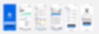
With the brand identity fully defined, it was time to bring it to life.
I applied the visual system to the interface, transforming wireframes into polished, high-fidelity designs that captured both function and feeling.
High Fidelity Wireframes
Assets
With the visual identity in place, I focused on building a consistent and reusable system.
Guided by Brad Frost’s Atomic Design principles, I created a UI library made of small, modular components that could scale seamlessly across the product.
UI Library

I finally had all the pieces to bring the vision to life.
Using these components, I built a high-fidelity prototype that brought the product to life — interactive, cohesive, and ready for real-world feedback.

Marketing Website
With the product vision and experience fully shaped, the next step was to design how it would be introduced to the world. I created a responsive marketing website to serve as the first impression — a space to communicate the app’s value, reflect its brand, and guide users toward taking action.
My Design Plan covered the following bases:
-
Draw exploratory sketches
-
Craft grayscale Wireframes
-
Organize content Flow Diagram
-
Create High-Fidelity Prototypes

Sketches
Content Flow Diagram

Website

Closing
Design Impact
+ Future Thinking
Cryptonite was created for those new to the field of cryptocurrency, designed to empower investors with the knowledge they need to make informed crypto decisions.
Connecting the investor to the market in a new user-friendly way, Cryptonite allows them to dive into a new market almost instantly through easy steps and an abundance of resources.
By serving all investor needs until final purchase, Cryptonite is the trusted middleman to Web3.
However, a few questions need to be considered for the future of Cryptonite:
What could cause people to lose trust in Cryptonite?
How can Cryptonite be monetized?
Cryptonite must attempt to be unbiased with informational sources and must be factual over opinionated. In order to be keep an investor's trust, information must be sourced with evidence.
In regards to monetization, Cryptonite will receive a tiny "finder's fee" for every purchase it navigates. With a large user base, this could be a major method of monetizing Cryptonite.
Key Learnings

The design process exists for a reason: it has been tried and proven through countless creations, created for success.

Multiple perspectives can lead to vast changes within the interface, designs you may not even have previously conceived.

Documenting your whole process allows others to understand and get behind your design decisions - show your work.
Next Steps
1. Conduct another round of user testing with High Fidelity for revisions
2. Add further features within the app and flesh out all features
3. Develop into a fully working app with code
